Advertising: The Power of the Image
Throughout its lengthy existence, KLM has produced an enormous amount of advertising material. The posters are particularly interesting. They show very clearly how advertising has been perceived over the decades. I’ll offer a few examples here.
From the very start, KLM has always emphasized its Dutch roots, for instance, in its advertising series, “The Flying Dutchman”. To this day, the Flying Dutchman logo can be seen on every KLM aircraft. There were other ways that stressed our Dutch roots: The red, white, and blue stripes of our flag have decorated the tails of our aircraft for a long time. Also, the recognisable image of tulips, wooden shoes, and windmills have always made their way into our communications.
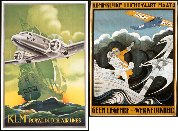
KLM advertising 1934 en 1920
Super Constellation
Does it get any more Dutch than that? A staunch Dutch girl (below left) in traditional Dutch dress casting her glance out over the dunes long decorated the pride of the KLM fleet: the Super Constellation. The “Super Connie” went into service for KLM in 1953. In the plane’s “Royal Constellation” compartment, an on-board chef created a seven-course meal, including champagne. This aircraft featured the Dutch girl standing on the dunes—and rightly so.
A little Dutch girl
In the mid-1950s, photography played an ever-increasing role in advertising. Very often, the posters consisted of more than one photo. This poster is a particularly good example, even if its creation was rather different than the Photoshopped versions that we have now. The aircraft is an illustration which is pasted into the photo of the girl in the dunes. In this case, the illustrators chose to use a person in traditional Dutch dress standing on the dunes, watching an approaching aircraft.
The theme harks back to advertising from the shipping world. The only difference is that the image of someone looking out over the waves seems a bit more realistic than a Dutch girl in the dunes watching an aircraft. There is an in-joke here as well: Her clothing tells Dutch people that she comes from Volendam on the IJsselmeer lake—and far from the North Sea where the dunes are—but only the nit-pickers will make a fuss about that. And, to be fair, it’s the most recognizable dress, so it’s a very Dutch image: a little Dutch girl, the wind in her face, on the sunny Dutch coast.
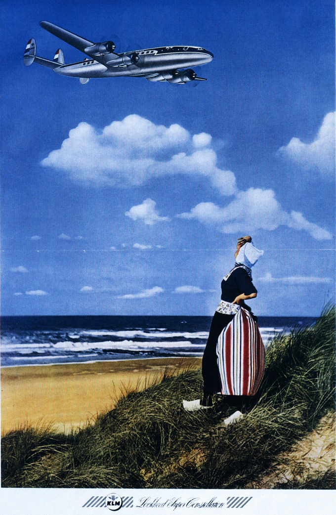
KLM advertising 1953
KLM advertising 1957
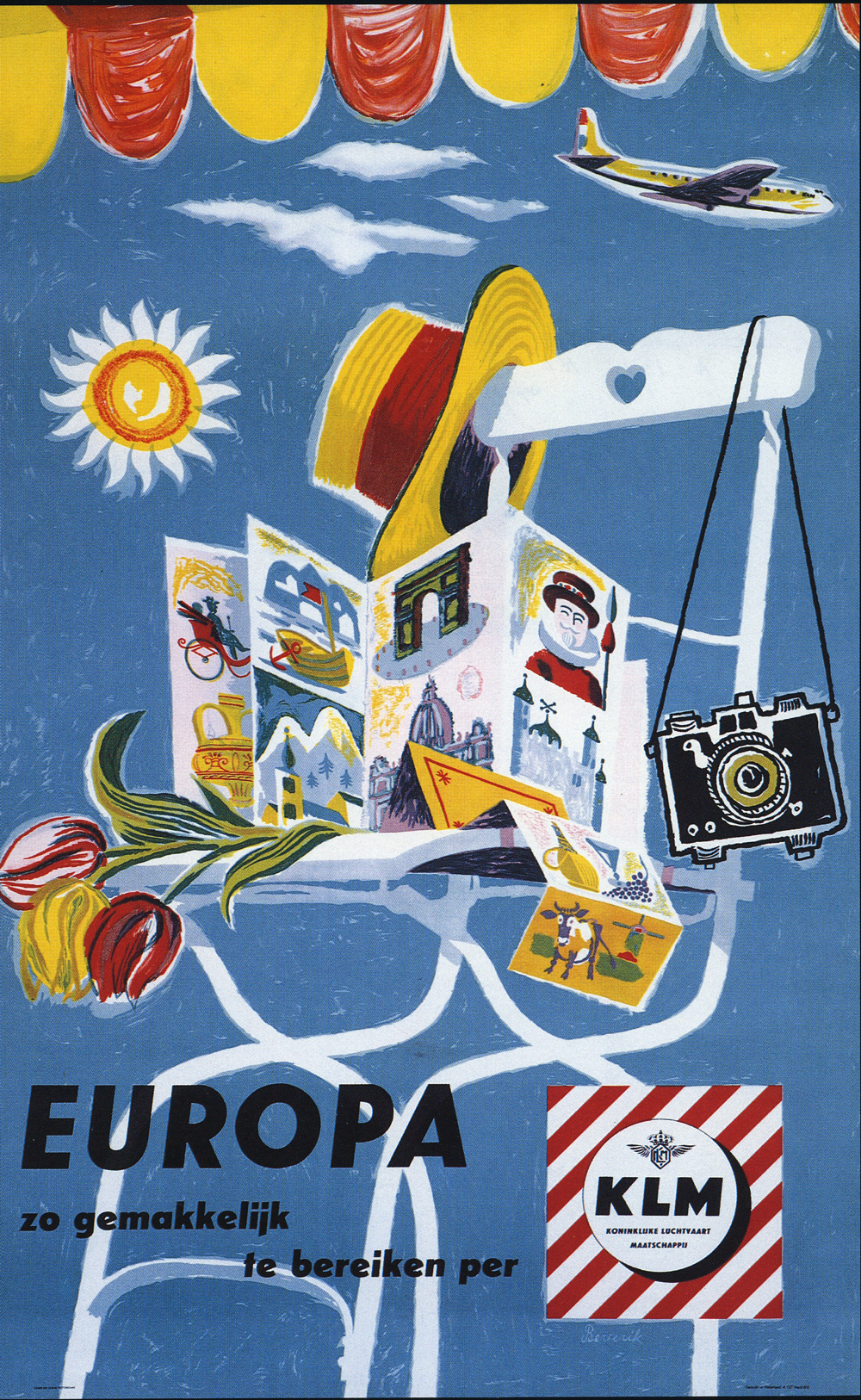
Just as colourful, if not more so, is the poster by the Dutch artist Herman Berserik (above). The Exhibitions and Showcases department, for instance, created “show cards”. Berserik (1921-2002, The Hague) received a considerable commission for these in 1957. He had created posters for KLM in the past. Now, though, he was commissioned to create forty different designs.
Herman Berserik
Herman Berserik created a wide body of work. Besides a great number of paintings, his designs can be found on book covers, he illustrated children’s books and, in addition to the work he did for KLM, he created work for the Dutch phone and postal agency (PTT) and for electronics giant Philips. His style is recognisable in its humour, bright colours, and sometimes surrealistic mood. The poster above is extremely characteristic of his style.
Blue sky
This (below) particular advert dates from 1982 and is the first in a line of many created over the years to come. The strength of this campaign is in the conspicuously blue sky which immediately brings KLM to mind. Its recognisability has everything to do with perseverance—laying down a style and then creating endless variations on the theme, worldwide.

KLM advertising 1982
“Is that all there is?”
Jan de Soet, then deputy president and director of KLM, made an impassioned call for a consistent, worldwide house style and wanted to see it repeated in our advertising. The commission for the new design finally went to a new ad agency: Prins, Meyer, Stamenkovits and Van Walbeer, or PMS for short. Their brief was clear: Create a distinctive, worldwide image that fits with the house style, is credible, and which can stand the test of time.
The result did receive unanimous approval. Some voices in the media were rather dismissive about the quality. “Is that all there is?” was one reaction. Yes, that was it. Nevertheless, the foundation provided space for years of unlimited variation. It allowed for strong recognisability. Even though that has since changed, it laid the basis for consistent design and all the advantages it had to offer. Every beginning is difficult. Sometimes, though, it’s just a question of persevering.
If you enjoyed this, you might like to read about our strong and lasting logo. Or take a look at the KLM logo through the years. What did our logo look like a hundred years ago? Has it changed a lot since then?