Happy Birthday KLM Crown
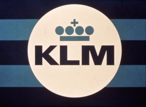
These days, a company without a logo is inconceivable. Popular brands often don’t even need to mention their name: the logo says it all. But the importance of a logo has not always been so clear, and that also applied to KLM. For KLM, the turning point was in 1961 when a new logo was designed with the well-known crown, underlining the ‘Royal’. And it still does after fifty years.
KLM recently celebrated its 92nd birthday. In the early years, the KLM logo and what we now know as ‘house style’ were not used consistently. There was no clear vision on how to use the logo and the company colours. In fact, sometimes the logo was not used at all, only the letters KLM.
Things changed after the Second World War. KLM aircraft were easier to identify from the Dutch tricolour on the tails of the aircraft. Over the years, it became clear that the consistent use of certain style elements led to more recognition. So KLM decided to investigate how even greater recognition could be achieved. The recommendation was to develop a new logo that would have instant impact. This would give KLM a powerful image.
KLM approached Ogilvy, Benson & Mather, a New York advertising agency, and asked them to conduct a public opinion survey on the image of KLM. The results showed that KLM scored highly on aspects such as cleanliness, punctuality, friendliness and hospitality. So it was decided to promote KLM as the ‘reliable’ airline. And to visually underline this image, a new, powerful logo would be needed.
KLM’s management saw the importance of this and approached the graphic designer F. Henrion (1914-1990). A pioneer of what is now known as ‘corporate identity’; Henrion came from London to KLM’s headquarters in The Hague, listened attentively and went to work. On the plane home he sketched what was to become the KLM logo on a napkin.
The logo Henrion presented was modern, combining the letters KLM with a crown. The new crown design – which in fact is nothing more than a line, four balls and a cross – became recognisable by its simplicity. The viewer knew at a glance that this is KLM. Henrion’s stroke of genius was simply to reverse the image, with the four balls representing the spaces in a real crown. This made the image much clearer than the traditional crown that had been used up to then. It was easy to recognise in both large and small versions and was also clearly visible in bad weather conditions. Simple, but brilliantly effective.
In 1963 the logo and a new house style were officially introduced and presented to the organisation worldwide. The design with the crown was so strong that it still clearly underlines the ‘Royal’ of KLM fifty years later.
Celebrate this golden jubilee with us on facebook.
Karin
Corporate Communications
