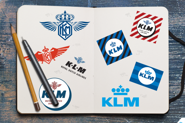
Logo love: the KLM logo through the years
As a social media content designer, I basically see our KLM logo every day. When I cycle to work it greets me on the roof of our headquarters, or when I see a plane overhead, or in all the content I edit or post online, the KLM logo is everywhere. I sometimes even dream about it (maybe I should talk to someone about that..). Last month, we changed the logo on our social channels to the temporary, special KLM100 design. This got me wondering. What did our logo look like a hundred years ago? Has it changed a lot? Let’s take a trip down memory lane!

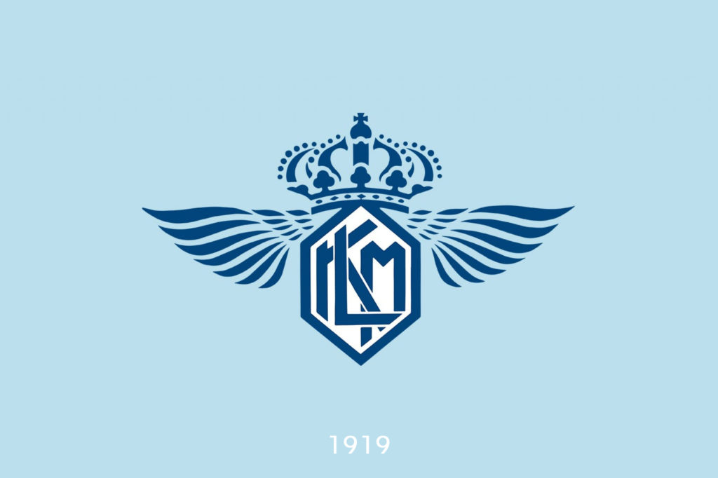
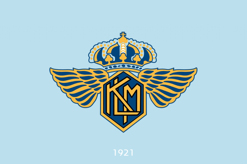
1919-1949: Roosenburg’s finch
Even today, the original KLM logo may be my favourite one of all. Its nickname is “the finch” (de vink in Dutch). Architect Dirk Roosenburg, was the one who created this beautiful logo – a monogram of the letters K L M with a royal crown on top and wings made up of seven feathers on each side. It was a logo worthy of a company that was granted the “Royal” predicate before we ever took flight (or even officially existed).
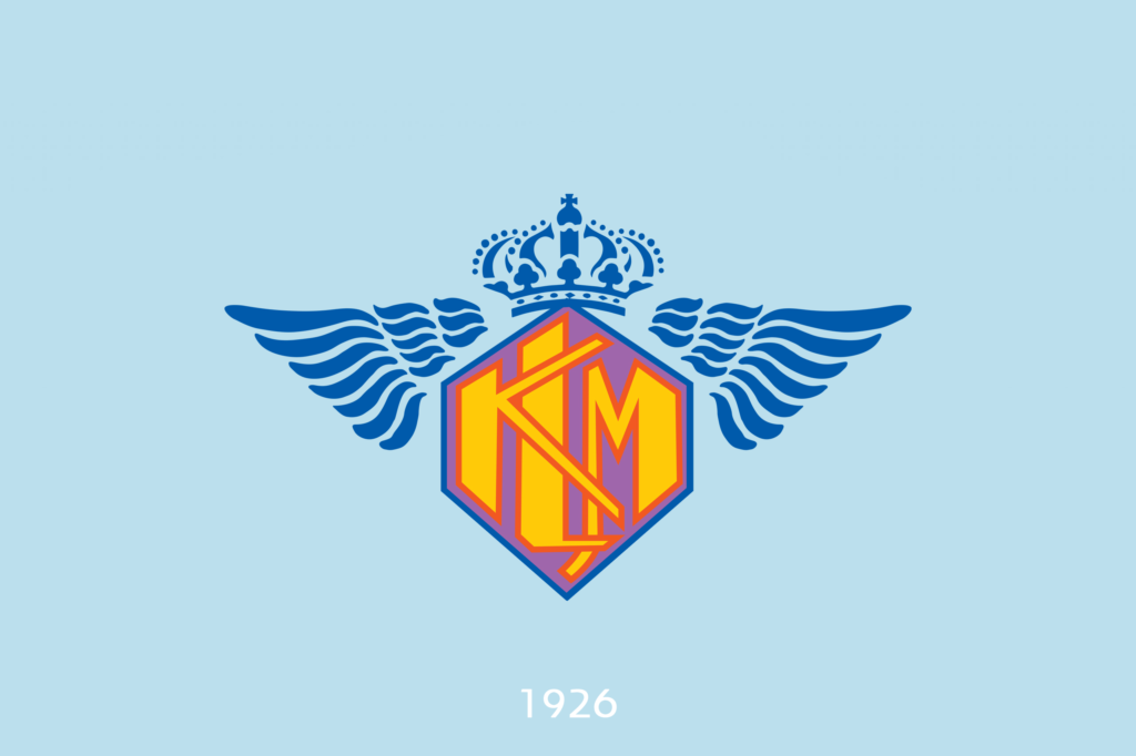
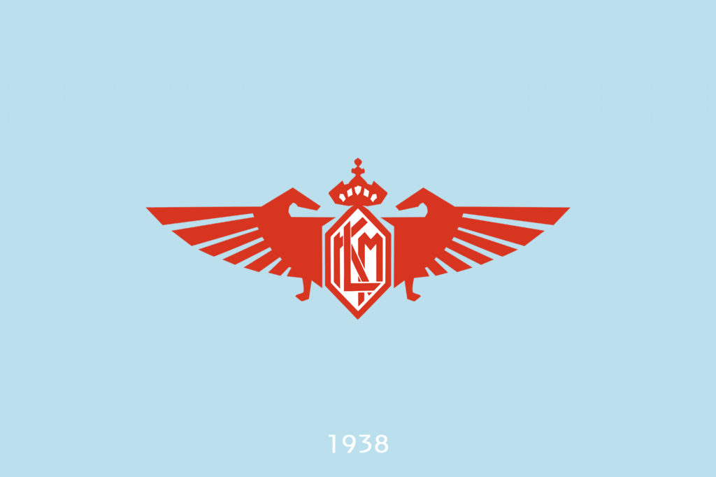
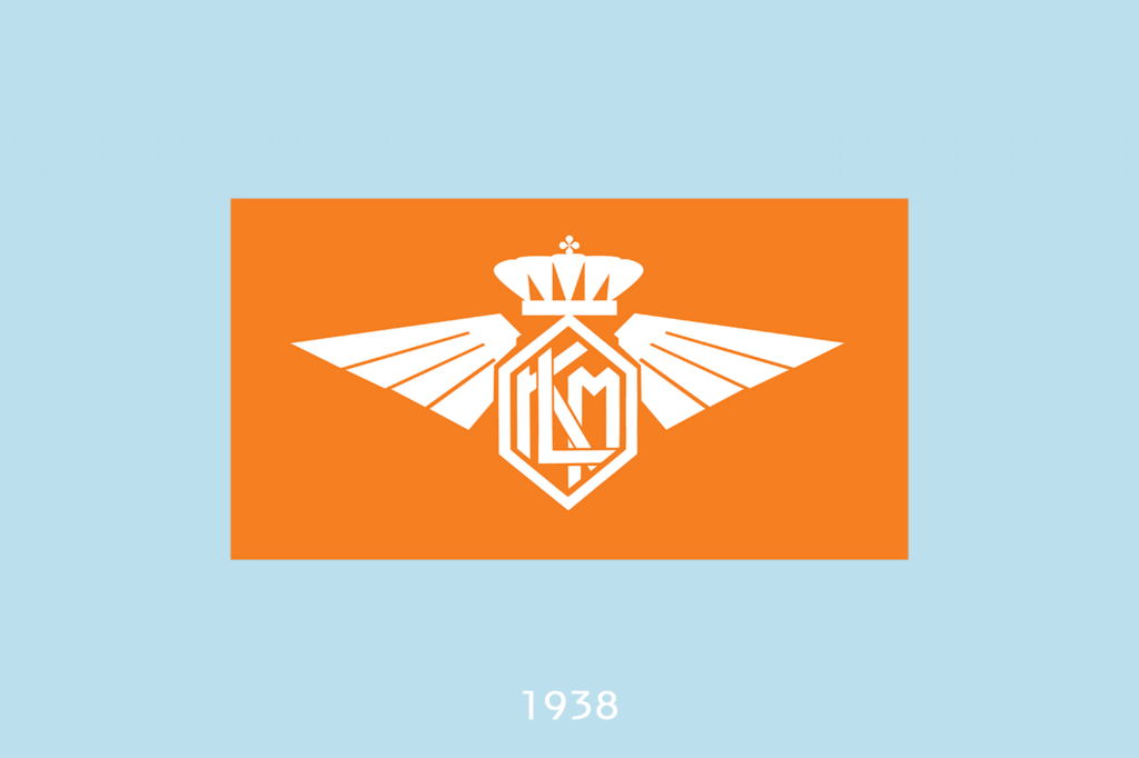
In KLM’s early years, the company had no fixed house style, so quite a few variations of the finch-logo made it into the air. Most were not used that often and just an embellished version of the original logo, with some added colour. Check out the barely-used logo from 1938 to 1944. It has the World War II aesthetic going on. It’s pretty aggressive, but I love it.
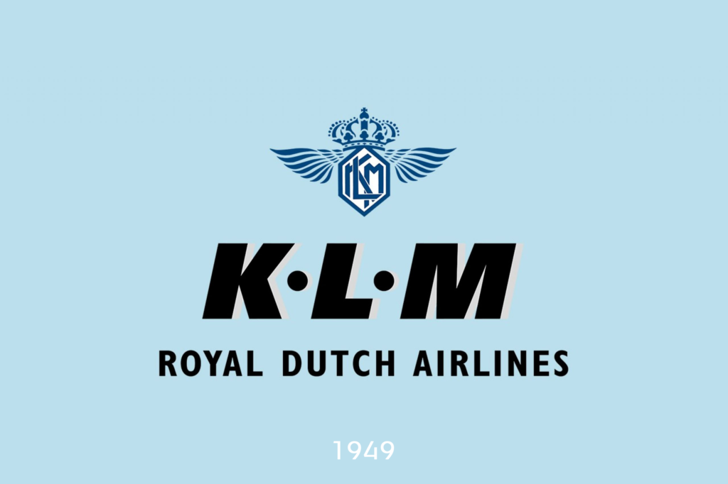
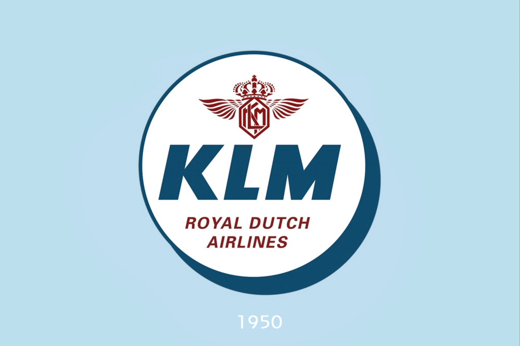
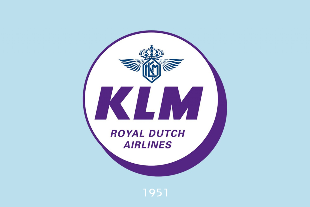
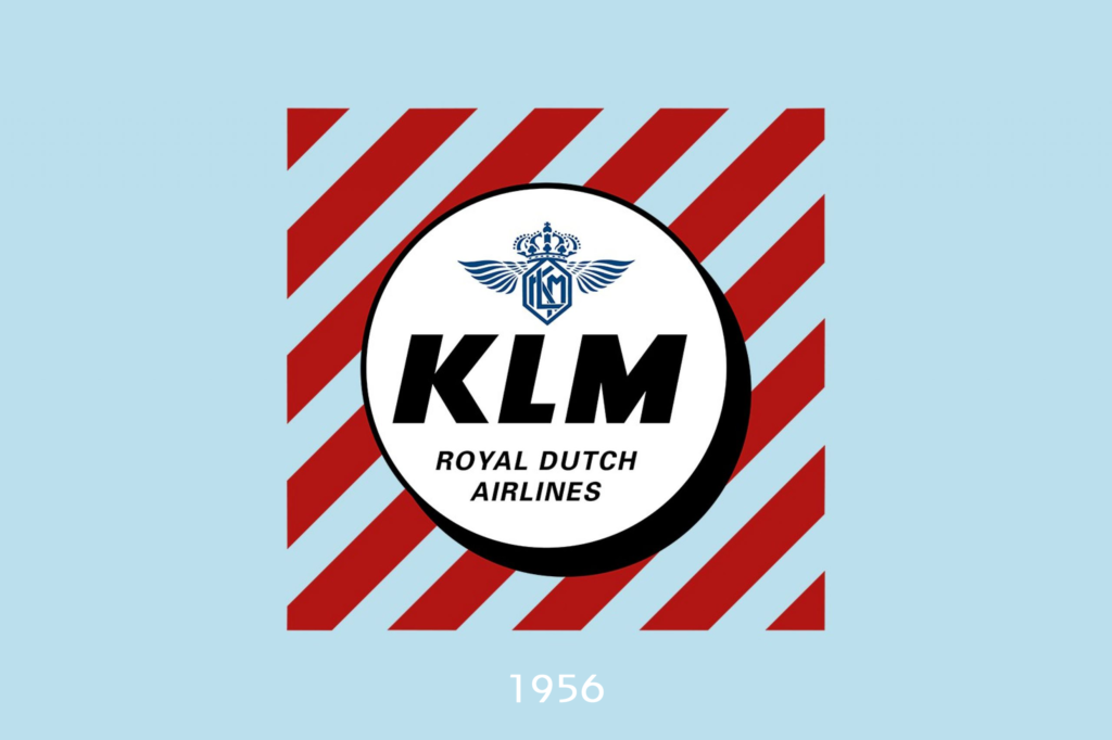
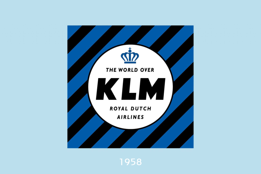
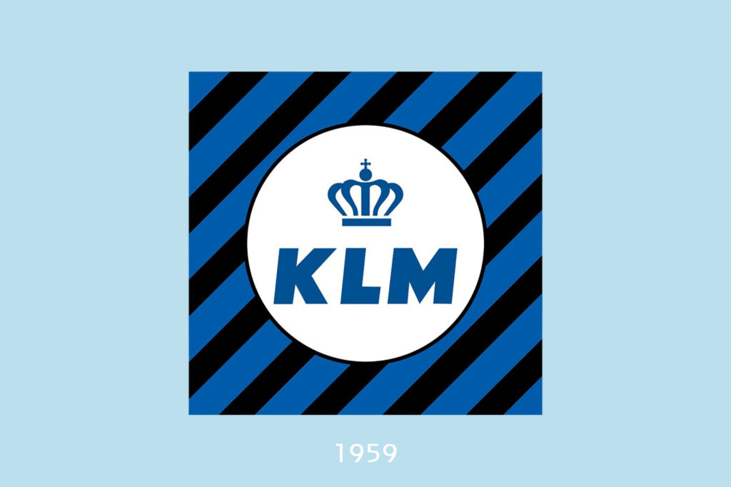
1949 – 1959: A decade of colour!
In the 1950’s, the focus shifted from the finch logo (some forty years later!) and its wings to the letters KLM (‘Dutch for Koninklijke Luchtvaart Maatschappij) and the words Royal Dutch Airlines. The logo turned a bit more recognisable in this decade. We added some cool (now very retro) stripes, referred to as the “ball-and-stripe” pattern. We also really loved colours in the fifties because we tried some purple and red before killing the black font and paving the way for a totally blue logo. In 1958, a simpler crown was added.
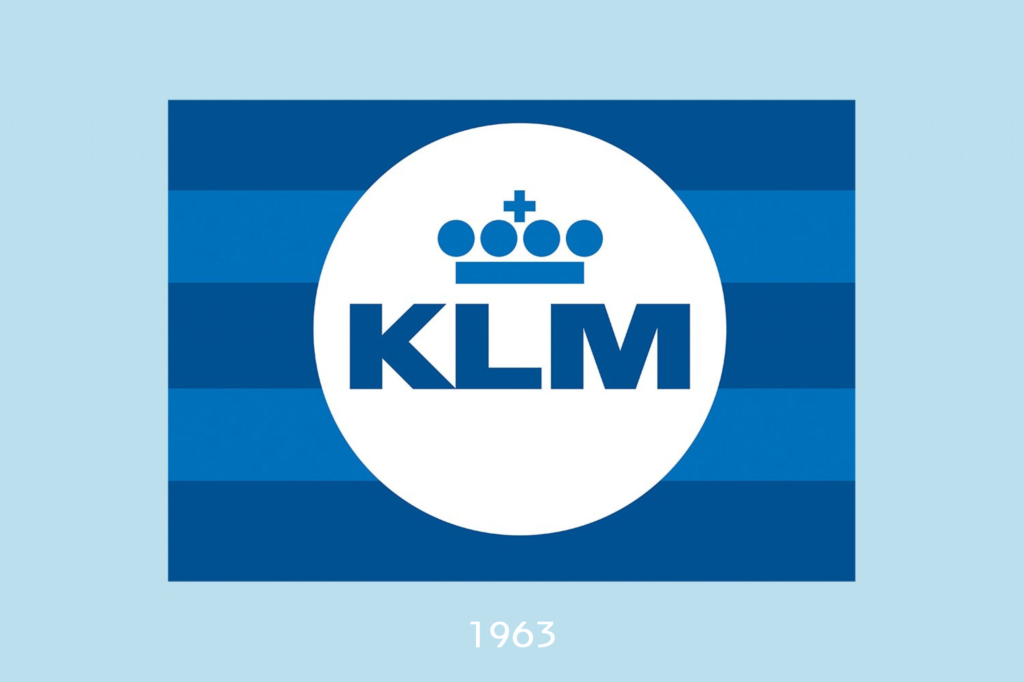
1959 – 1991: A timeless design
With the launch of this logo, we reached a turning point in terms of branding. The design department was looking for a way to enhance our recognisability, so they went in search of a more readable logo that would fit a clear house style in 1961. A survey, in which KLM commissioned the famous British advertising executive David Ogilvy, showed that KLM scored well in terms of hospitality, punctuality, cleanliness, and friendliness. In short, KLM was to be promoted as a reliable airline.
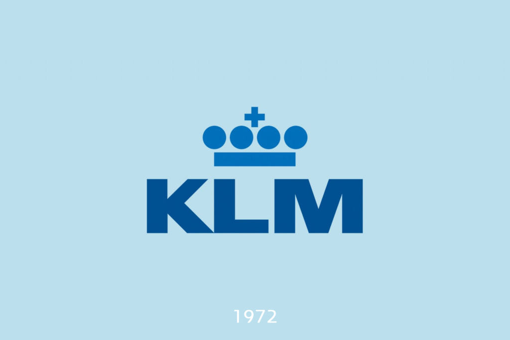
Enter Henri Kay Henrion (1914 – 1990), the British designer, now known as the pioneer of corporate identity, created this ingenious KLM crown: a stripe, four dots, and a small cross. He cleverly used the negative space of a traditional crown to make a super-clear logo that’s also recognisable in poor weather. In 1964 KLM officially introduced the crown and new house style were officially introduced throughout the organisation. In 1972, we said goodbye to stripes. Amazing how this logo is still going strong, almost sixty years later.
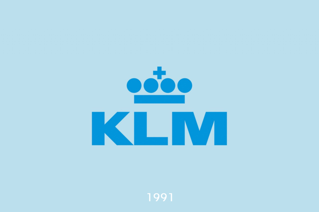
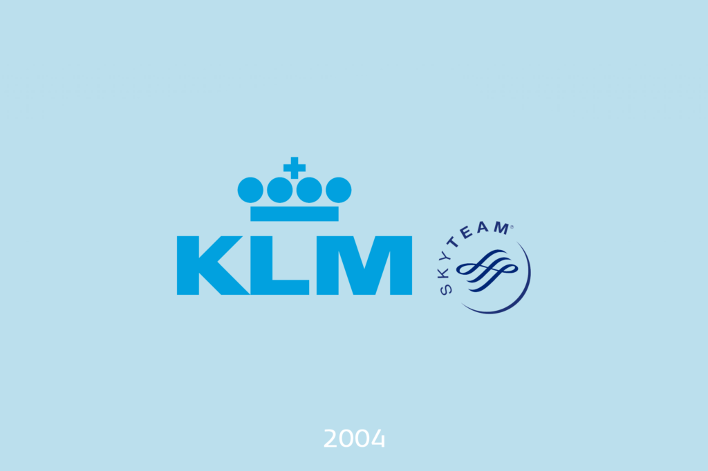
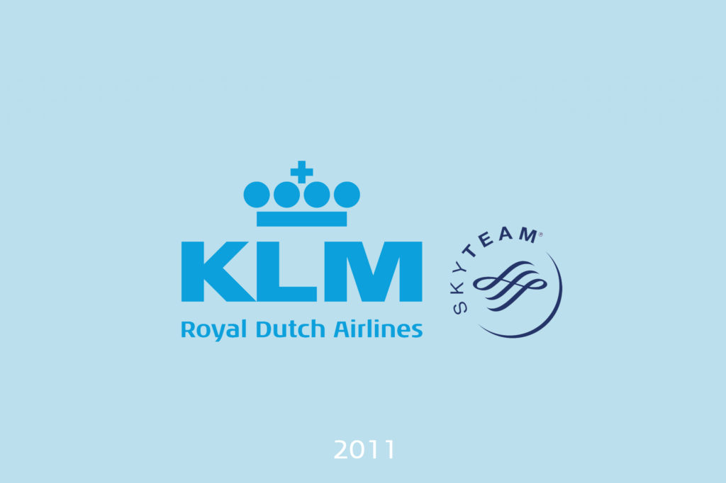
1991 – 2019: The KLM logo as we know it
And then there’s 1991, the year when the logo went light blue from top to bottom. Maybe they were thinking “Hmm, it might be useful for our future designers and aircraft painters if our logo is just one colour,” and they would’ve been right. I know the hex code by heart (it’s 00A1DE, officially called Pacific Blue) and here in the Netherlands, it’s super recognisable as the KLM blue. Over time, we added the SkyTeam logo and “Royal Dutch Airlines”. Essentially, though, the logo hasn’t changed since 1991. It’s timeless!
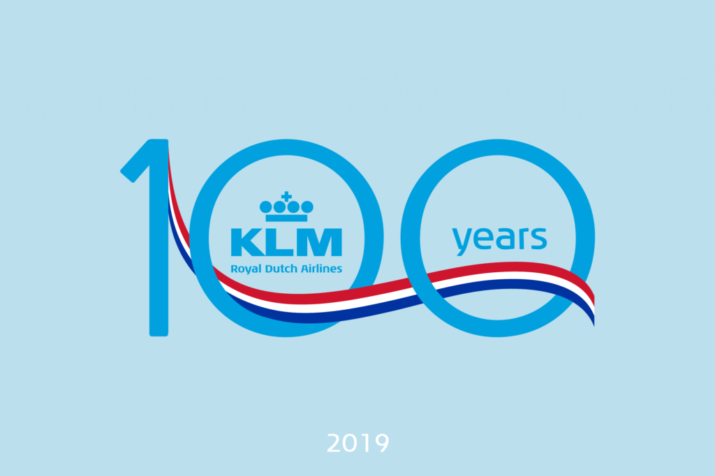
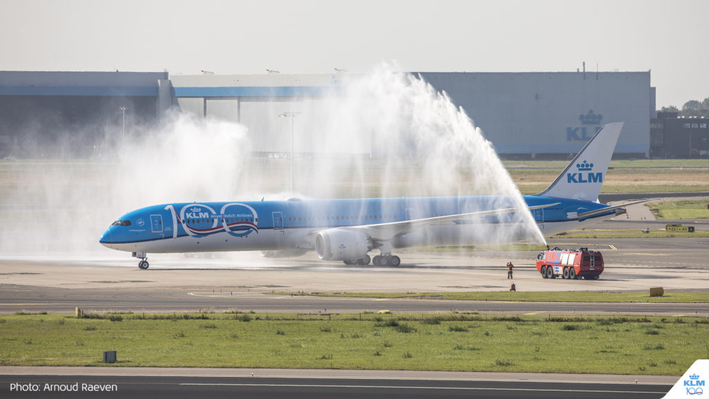
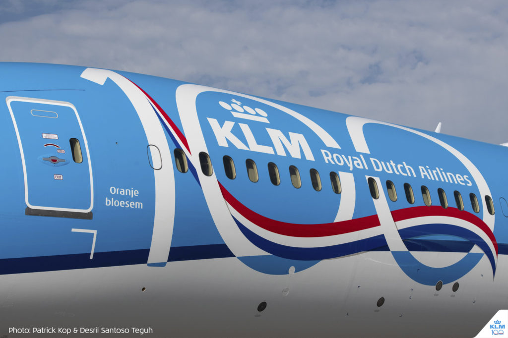
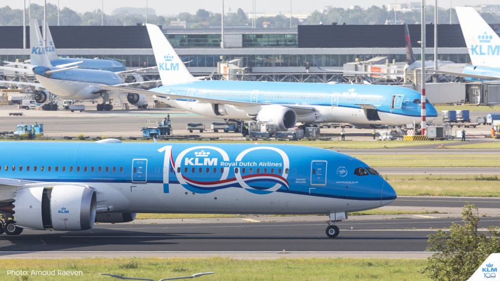
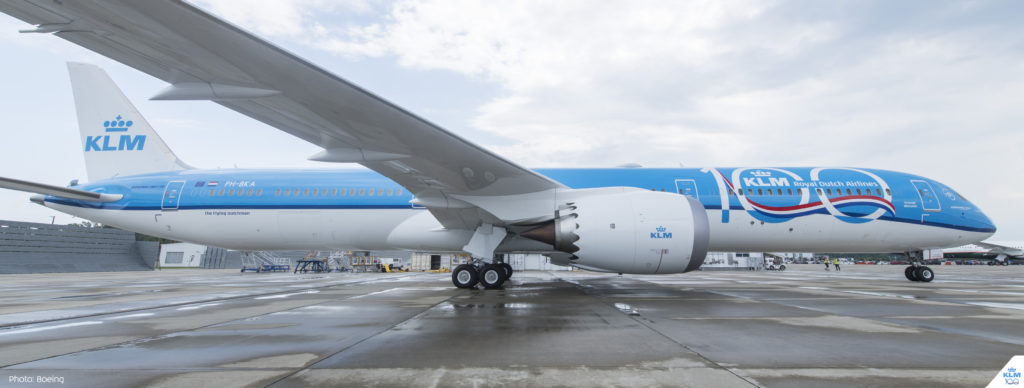
2019: A special way to mark one hundred years
On 7 October this year, we will turn a hundred years old. Wow! Our design department created this special logo to mark this occasion. It’s clean, it’s Dutch and I like it. It’s visible all around the world, as there are KLM 100 stickers on most of our planes. Maybe you’ve spotted Orange Blossom (PH-BKA) with the logo painted big on both sides? If not, keep looking up!
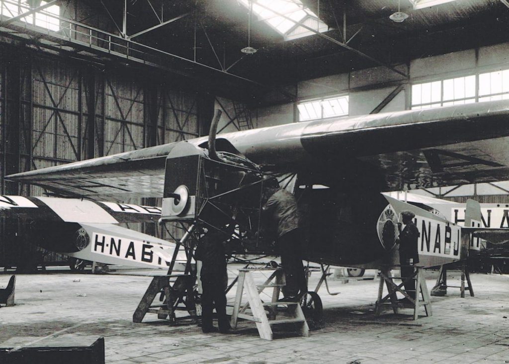
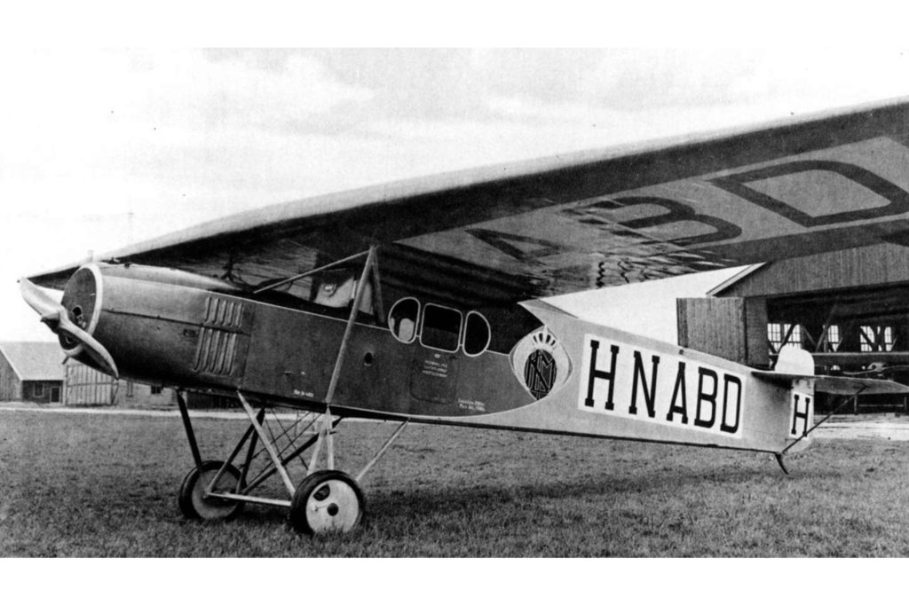
What about these cool Fokkers?
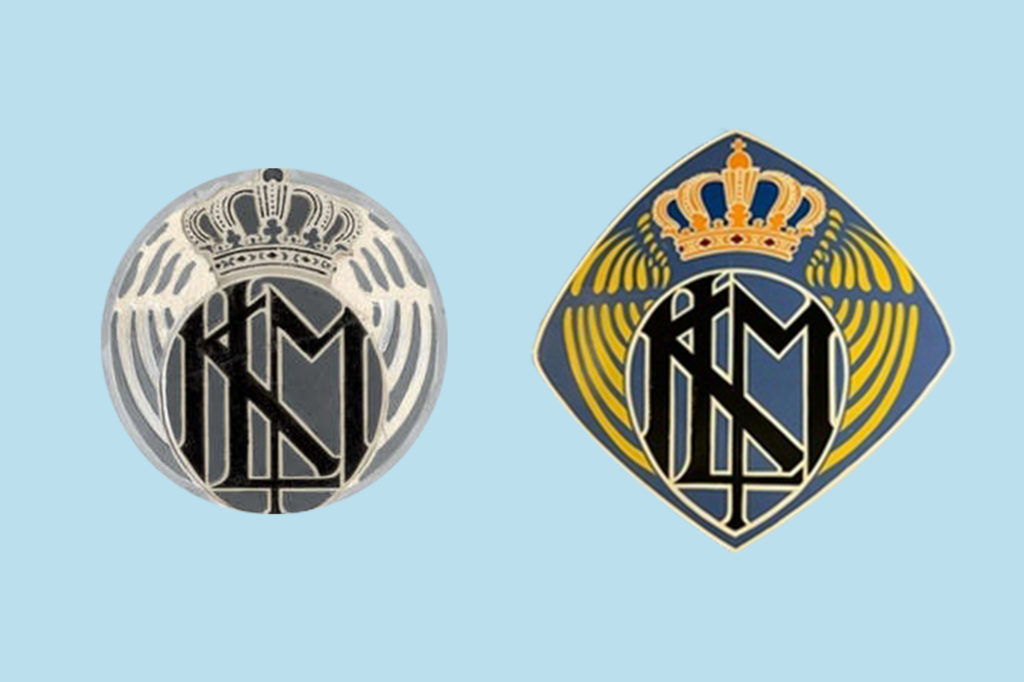
This isn’t really a logo, but I loved it so much that I wanted to share these emblems as well. Back in the 1920s, we started flying these cool Fokker II’s and III’s decorated with an Art Deco variation of Roosenburg’s logo on the sides. Look at the little guy painting it on the H-NABJ. It looks a bit like logo’s wings were too wide for the plane, so they fit them into a tighter circle. I’m not sure about the actual colours but I came across a photo of a Fokker II replica and the emblem was black, blue, orange and yellow. I guess we already loved orange back then.
I’m curious to see how, and if, our logo will evolve in KLM’s next era. If you’ve got any great design ideas, let me know.

P.S. We made some nice KLM 100 themed GIFs so you can add the anniversary spirit to your stories and conversations. Yay!