The Stories Behind 4 KLM Posters
Advertising is more than just a pretty picture intended to seduce potential customers into buying a product or service. It also says something about the company or the era in which it was made, revealing cyclical patterns, images and ideas that keep returning. This certainly goes for KLM’s advertising. In this blog, I’ll discuss a selection of posters that each have a story to tell.
Cooperation
This isn’t really a poster. It’s a display that travel agents or ticket offices could put out in their window. Back in those days, window displays were given a great deal of attention. This one, dating from 1929, confirms that KLM was already cooperating with other airlines in the early days, using and supplementing each other’s networks. The Swedish carrier ABA was founded in 1924 and was later taken over by SAS. Cooperation was important, because it wasn’t always possible for carriers to serve specific routes alone. The KLM-ABA partnership operated on the Amsterdam-Malmö route. This display made it clear, at a glance, that passengers could catch connecting flights to Paris, London, Oslo, Stockholm and Helsinki (which the Swedes call Helsingfors). In short, the Nordic region was made accessible to people in regions south, and vice versa.

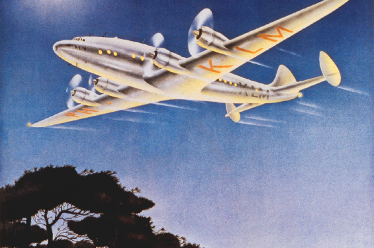
New aircraft
Judging by the silhouette, this is a DC-2. The poster dates from 1933 and actually precedes the arrival of this aircraft type. KLM’s first DC-2, the Uiver (Stork), wasn’t delivered until September 1934. KLM founder Albert Plesman was so enthusiastic about KLM’s first full-metal aircraft, however, that he wanted to have advertising material ready and waiting. It is highly likely that this poster was, in fact, designed at the request of the KLM office in Paris. KLM’s outstations often approached their local market in their own way. This is confirmed in the margin, at bottom right. If you look closely, you will see the words “Poster Nova Paris”, which was probably the printer. This poster was designed by Satomi, a Japanese graphic designer who lived in Paris. His signature is in the middle, on the right. Back in those days, flying from Paris to Amsterdam in two hours and twenty minutes was superfast, which was obviously something that needed to be more widely publicised.

Take care of the pence
For many years, KLM’s service between Amsterdam and the Dutch East Indies (now Indonesia) was the world’s longest intercontinental route. KLM charted this route itself and it became an important link between Europe and Asia, as well as all the places in between. It was much like an airborne Silk Route and it featured in vast quantities of promotional material. This poster dates from 1937. Thirteen years had passed since Captain Van der Hoop and his crew had completed the inaugural flight. A historical journey, which had people on the edge of the seats. The route to the East Indies did very well in the 1930s. There was growing demand and flight frequency kept increasing. This poster is testimony to Dutch frugality. To avoid having to print a new batch every time, KLM came up with a smart solution: the figure at bottom-right can quite simply be replaced, allowing flight frequency to be simply and cheaply updated. In short, take care of the pence, and the pounds will take care of themselves.

Homebound
No destination on this poster, but a sign of hope. It dates from 1944, when the Netherlands was still occupied and KLM really only existed on paper, apart from its operation in the West-Indies. Even the brand-new offices in The Hague had been rented out. At the time, Plesman suspected that the war wouldn’t last much longer and therefore contracted several designers to come up with posters expressing the hope of a better future and a swift return home, after many years of displacement. Plesman had experienced this personally, because, after his arrest in 1941, he had been forced to take exile in a village out in the province of Twente. It was not until 1945 that he was able to return to The Hague.

Homebound was the theme. Plesman eventually chose this design, which also inspired him to write an extended letter, in which he put his vision to paper in minute detail, convinced that it would ultimately be implemented. I’m not sure if the sun is rising or setting in this poster, but I suspect it is the former, expressing the hope of a new beginning.